
Problem Space
As the final of four projects completed in Interaction Design Studio 1 at Carnegie Mellon's Human-Computer Interaction Institute, students were asked to design a responsive website to help solve a common business problem. We were challenged to take a mobile-first design strategy and use common design patterns for small screens. My team chose to focus on grocery shopping during a pandemic, with the grocery stores as our intended clients.
01
User Interviews
Talking directly with shoppers to learn their struggles.
We first had to interview grocery shoppers to identify pain points in the pandemic shopping experience and learn what domain areas deserve our attention. The directed storytelling research method - where participants are encouraged to tell a story of their most recent shopping experience - was perfect for our needs because it was easy and quick to conduct while still returning valuable insight. Our clients' most profitable customers are families and groups, so I found parents and college students living with roommates for my interviews. After each interview I converted my notes into a customer journey map, which made it easier for me to recall the participant's story and share it with my teammates.

Customer journey map for one of my participants
02
Research Analysis
Pulling insight from common pain points.
My project team regrouped after our interviews and used our notes to make an affinity diagram. The process helped us synthesize our findings and identify common pain points among multiple shoppers. We ended up with three main insights that we hoped to address with our responsive website:
- Families and college roommates are designating one person as the group shopper to reduce potential exposure, but it is often a struggle for that one shopper to receive everyone's list of groceries. That shopper also worries about mistakenly buying the wrong items while at the store.
- Customers want to minimize their interaction with employees and others in the store. This often led to frustration when they needed to ask for help locating an item (a frequent occurrence since they were buying unfamiliar items for others).
- Customers reported finding an item is out-of-stock once they made a trip to the store as a top source of dissatisfaction.
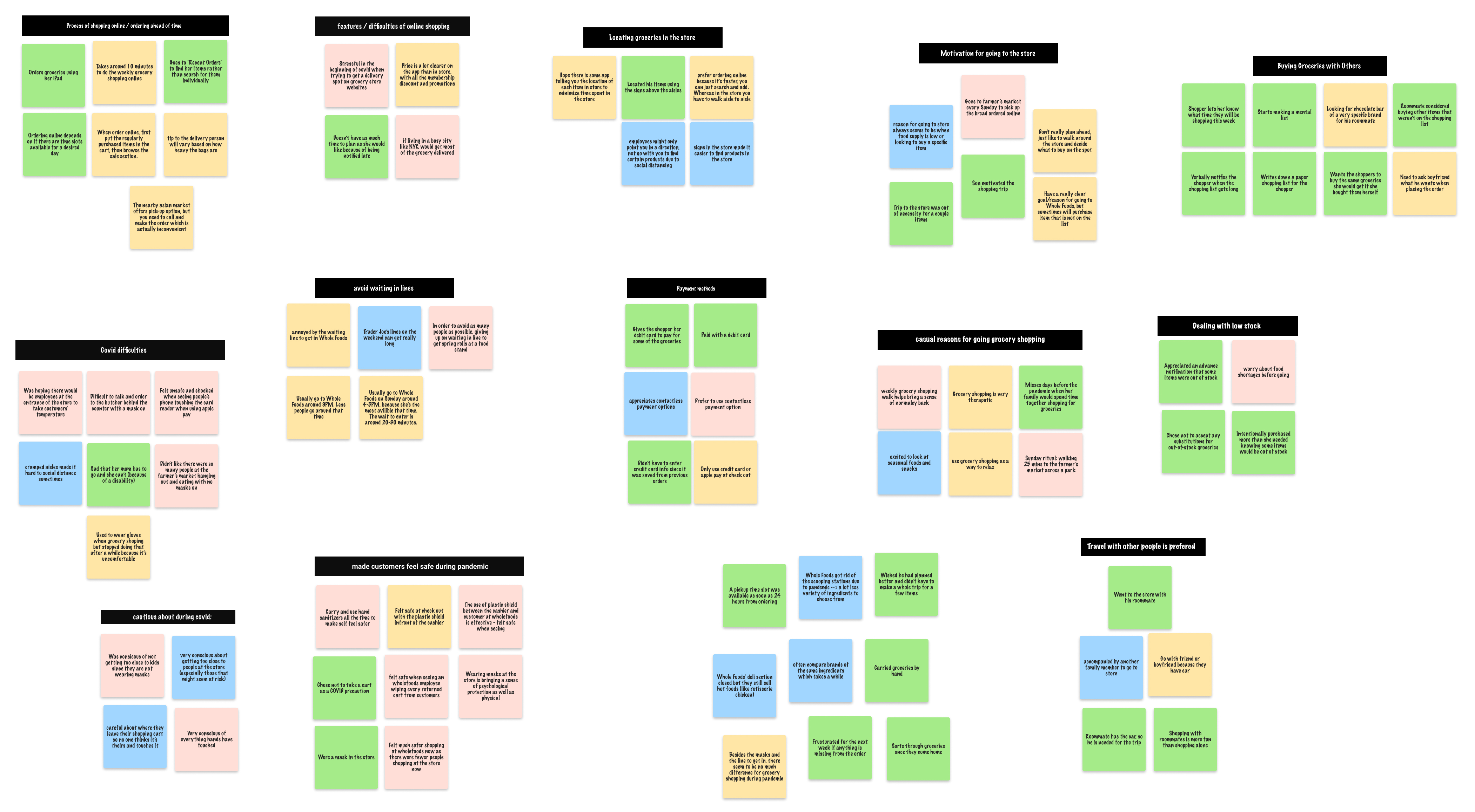
Affinity diagram of our interview notes
03
Key Iterations
Peer critique allowed us to fix our design flaws before deployment.
My team brainstormed a solution to each of the above needs. An online collaborative shopping list would allow groups to coordinate their groceries easier. This list would have access to a database of the groceries in-stock at a given store (the same database used for online shopping), so the shopper would know what needs substituted before going to the store. The website could then take this list and map out the fastest route through the grocery store, minimizing the time spent at risk of exposure and solving issues with locating an item.
Designing the website comprised of several iterations of increasing fidelity, separated by class critiques and think-aloud user testing to provide constructive feedback. The most significant changes to our design occurred in four places.

Iterations of the list page
We considered several different ways of presenting the collaborative grocery list. Initially we allowed for multiple lists and sorted them by date, but after considering how grocery lists are used, we settled on just a single, always-running list to provide users with greater simplicity.

Iterations of the map layout
Early versions of our map display didn't match closely to the actual layout of a grocery store. To help our clients visualize our website in their stores, we attempted to make an accurate-looking map. We also organized the items in the map list by location to quicken the process of checking off groceries.

Iterations of the display of items on the list and map pages
Building a grocery list and using the list to shop are two distinctly different actions, so to best use the space available on a small mobile device, our team realized the opportunity to selectively show product information based on the use case for each screen. Because the product we are designing is only a shopping list, we intentionally left out information about pricing. We also did not want too much information overlap between the list view and map view. For example, the user doesn’t need to know an item’s aisle number when they are building the list at home.

Iterations of website navigation
Our website has a distinct user flow: log in, add items to the list, and generate the store map. Thus we initially broke from traditional design patterns and attempted linear navigation through the website. This ultimately was more confusing to users and we conceded to using a classic hamburger menu. Though this control weakened our user flow by offering more freedom, they were able to operate the site with less guidance.
04
Responsive Design
Accessibility at home and at the store.
Responsive design was the keystone of this assignment. By designing mobile-first, we were forced to fit the constraints of a small screen before expanding to larger desktop layouts. The transition felt very natural and the established list and navigation design patterns we used converted without a struggle. It was important for our website to be responsive because of its diverse set of users. A mobile view was imperative for the map view to be used in a grocery store. Yet older adults who are collaborating on the list and prefer desktops over small devices will want to add their items on a computer. These larger devices are also more comfortable to type on if many items need to be added to the list at once.

Differences between the laptop and mobile versions for the list page and navigation
05
Pitch
Selling our final solution to the client.
For the class, we chose to personalize our pitch to Whole Foods. The pitch was divided into three sections: understanding the problem and current state of pandemic shopping, how our responsive website design helps solve current pain points, and how our design provides value to both customers and the business. We started off with quotes and insights pulled from our user interviews to establish the problem space, then walked through the main characteristics and functionalities of our prototype from the perspective of our persona family. To highlight the value our design brings, we made sure to explain our vision and goals for Our Shopping List, discussing the improvements that could be made to the current grocery shopping experience during the pandemic.